The relative strength index is a momentum oscillator, used by traders as a technical indicator to identify potential buy and sell alerts

Contents
- What is the Relative Strength Indicator?
- How to calculate the Relative Strength Indicator
- How to read the Relative Strength Indicator
- The drawbacks
The Relative Strength Indicator, or the Relative Strength Index (RSI), is one of a range of data tools that can be used to measure the strength of a market. It is an oscillator, meaning that it consists of a line that moves up and down and helps traders work out if something is overbought or oversold.
What is the Relative Strength Indicator?
The Relative Strength Indicator was created by J. Welles Wilder Jr in 1978. Wilder was a mechanical engineer before he retrained as a trader and technical analyst. He first published the book New Concepts in Technical Trading Systems.
He came about the idea because he had been faced with a problem. When he was trading commodities and stocks, even if he saw something where the price trend was strong and rising, he had no quick and easy way of finding out if the price was too expensive to open a long position. Likewise, if something was dropping, it was not immediately clear if the right thing to do was to go short. It was this particular conundrum that led to him creating the RSI.
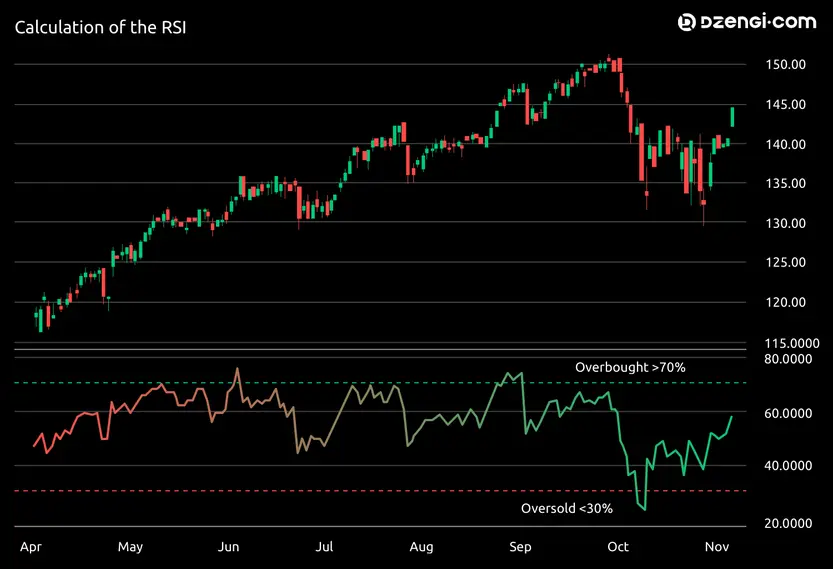
If you look at the RSI, you will usually see three lines. There is a straight, dotted, line at the top, a straight, dotted, line at the bottom and a wavy one in the middle. Often, but not always, the wavy line crosses over the other two lines. The x axis marks time, while the y axis has a value of between 0 and 100. The top line usually stands at 70 and, when the wavy line crosses it, it means the stock is overbought. The bottom line usually stands at 30 and, when the wavy line crosses it, it means the stock is oversold. The wavy line is the Relative Strength Indicator itself.
It is worth mentioning at this stage that just because something is overbought or oversold, that does not necessarily mean the market is about to change course. All it means is that we can assume that things have gone further than they should have, quicker than they should have.
We can also use the Relative Strength Indicator to work out if a price trend is taking place. If we look at the y axis and find the 50 mark, then if the RSI crosses this line, a trend is happening. If it goes over the line, there’s a positive price trend, meaning prices are definitely rising, and if it goes below the line, then there’s a negative price trend, meaning prices are definitely falling.
There is also the matter of divergence. If we marry up the main chart with the RSI, and we see that, for instance, the price itself has hit a high and the RSI hasn’t, that indicates that we might see divergence. This can lead to retracement, where the price bucks against the overall trend. If this happens, it can lead traders to take it as a signal to either buy or sell, at least in the short term.
How to calculate the Relative Strength Indicator
If we want to calculate the RSI, we will need to calculate the average gain. That is the sum of the price increase over a certain number of periods of time. When Wilder created the RSI, he suggested using 14 periods. This is the most common number, but it is not essential that there are 14 periods. Then you calculate the average loss, which is the sum of the price decrease over the same number of periods as you used to calculate the average gain. You divide the average gain by the average loss. Then, you take the result, called the Relative Strength Factor, and convert it into a figure between 0 and 100.
If you want it as a formula, it looks like this:

How to read the Relative Strength Indicator
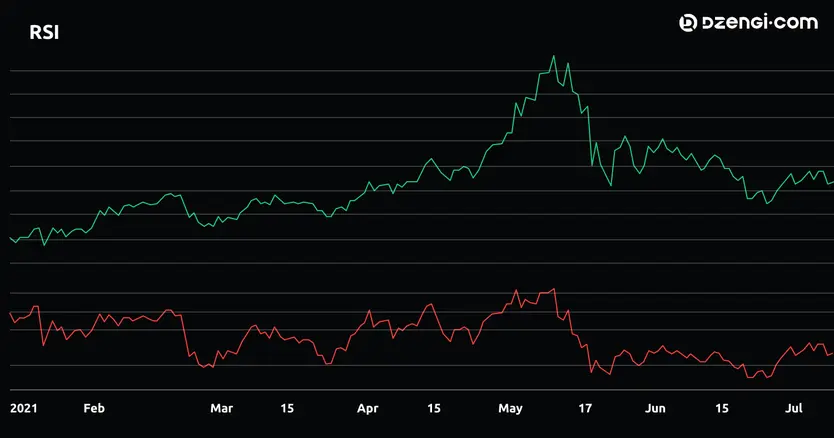
If we take a look at the RSI on this chart, we can see that there were times in April and May where the commodity (in this case, the ether cryptocurrency) was overbought. While the price has dropped since then, it’s not quite managed to get to the level where it is oversold. The RSI matches up pretty well with the main chart but, at the start, you can see that it is flatter than the rise in the main graph, which suggests there was some divergence going on.
The drawbacks
While the RSI is useful, it is not infallible. As with all systems, there are drawbacks. For instance, the RSI is good at telling us what has happened and it is good at telling us what is happening right now, but it can’t tell us what is going to happen in the future. And there is always the possibility that it can deliver some false signals, especially when used alone.
If you want to use the Relative Strength Indicator, you should remember that the prices of stocks can go down as well as up, and never invest more than you can afford to lose. You should do your own research and use a variety of tools, rather than just one, for market analysis.