Awesome Oscillator can be a useful indicator during trending markets to detect alerts

Contents
- What is Awesome Oscillator?
- How to read the Awesome Oscillator
- How to use the Awesome Oscillator
- Awesome Oscillator and zero-line crossovers
- Twin peaks trading
- Awesome Oscillator saucer strategy
- Advantages of the Awesome Oscillator indicator
- Awesome Oscillator indicator limitations
- FAQs
What is Awesome Oscillator?
The Awesome Oscillator Indicator (AO) is a technical analysis indicator created by American trader Bill Williams as a tool to determine whether bullish or bearish forces dominate the market. It measures the market momentum with the aim of detecting potential trend direction or trend reversals. The market momentum is evaluated using a combination of a shorter time frame and longer time frame simple moving averages; in other words, it considers the recent momentum in comparison with a higher frame momentum.
The Awesome Oscillator strategy is calculated as the difference between the newest five periods (bars) simple moving average (SMA) and the 34 bars simple moving average. But instead of the closing price, the indicator uses the bar midpoint value. Although it may look like the Awesome Oscillator formula is complex, it’s really quite simple, as shown below:
Midpoint value = (Bar high – Bar low) / 2
Awesome Oscillator = SMA5 – SMA34
The indicator is plotted as a histogram in a box at the bottom of the chart and the histogram bars are found in either of the two colours red or green (with some trading platforms, the lines can be red or blue). When the midpoint value of the last price is higher than the previous bar midpoint, the histogram is green (blue) and if the midpoint of the last bar is lower compared to the previous bar, it is red.
How to read the Awesome Oscillator
In simple terms, the bar is green if it has a higher value compared to the previous bar and it is red if its value is lower compared to the previous bar. Another element is the zero line, around which the indicator oscillates and moves between positive or negative values. If the indicator values are above the zero line, it means that the shorter period is higher than the longer time frame and vice versa. Thus, when the histogram moves above the zero line, it indicates that bullish forces are driving the market and when the Awesome Oscillator values are below the zero line, it points toward a bearish momentum.
How to use the Awesome Oscillator
There is a variety of strategies that could be used by traders to identify potential trading opportunities. Some of the better-known basic trading set-ups are the zero-line crossover, the twin peaks, the saucer and divergence.
Awesome Oscillator and zero-line crossovers
The basic alerts that are generated by the Awesome Oscillator are identified on the basis of the zero-line crossovers.
- A bullish buying opportunity alert occurs when the AO indicator crosses above the zero line, indicating that the short-term momentum is increasing faster compared to the long term.
- A sell opportunity is detected when the indicator crosses below the zero-line mark, meaning that the short-term momentum is decreasing more rapidly than the long term.
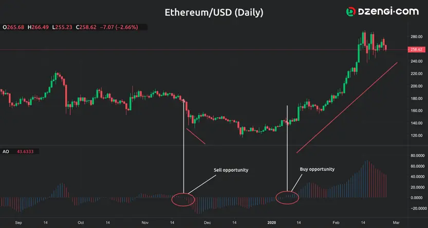
Look at the following graph.

Using the AO crossover signals, both buying and selling opportunities can be identified on the graph. The point marked with the red circle is showing a bearish crossover, which is an alert of potential sell opportunity. Also, the white circle marks a bullish crossover when AO crosses above the zero line, displaying an alert for a possible buying opportunity.
Twin peaks trading
Twin peaks trading is another way through which traders can identify potential bearish or bullish opportunities using the Awesome Oscillator indicator. The general guidelines when looking for twin peaks opportunities are:
- Bullish twin peaks – when there are two consecutive peaks below the zero line, where the second peak is higher compared with the first one and followed by a green bar. Keep in mind that the pullback (trough) between the two peaks should remain below the zero line.
- Bearish twin peaks – this set-up appears when there are two peaks above the zero line and the second peak is lower than the first one and is followed with a red bar. Also, the pullback between the peaks should remain above the zero line.

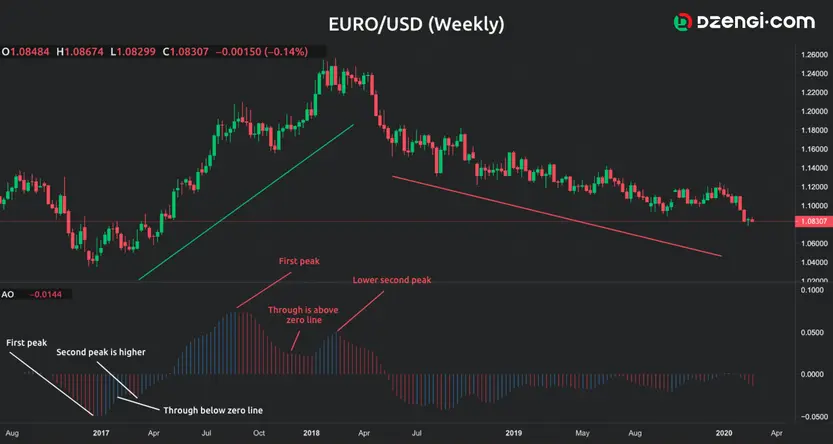
An example of a bullish and bearish twin peaks set-up is presented on the weekly chart for EUR/USD.
The white lines identify the bullish twin peaks set-up and you can see that there are two peaks where the second one is higher and the bar is blue (green) below zero. Also, the pullback stays below zero during the entire set-up. The blue line under the price bars shows that there is an increase in the price after the bullish twin peaks are identified. The red lines are defining a bearish set-up by identifying two peaks above the zero line, where the second is lower than the first and the histogram after the lower peak is red. Besides, the pullback also stays above zero during the entire set-up. You can also notice that the red line below the price bars displays a falling price since the formation of the bearish twin peaks set-up.
Awesome Oscillator saucer strategy
Traders also look for the saucer set-up signal when using the Awesome Oscillator in their trading strategy. The saucer trading strategy means that the trader is trying to find a specific set-up of three consecutive bars on the histogram in order to detect a bullish or bearish signal. Consequently, the AO saucer set-up can be identified as follows:
- Long position set-up – this is evident when there are two successive red bars and the second bar is lower than the first one. Also, the third bar must be blue (green) for the set-up to be completed. You would try to detect the following – red – lower red-green histogram. The trader can decide to buy the fourth bar.
- Bearish set-up – identified by two successive blue (green) bars, where the second bar is lower compared to the first bar and the set-up is completed with the third red histogram. Accordingly, traders try to find the following – green – lower green–red histogram.
As is the case with some other oscillator indicators, traders can also be on the lookout for potential divergence with the AO indicator. Consequently, they try to identify periods when the price and the indicator don’t move in the same direction. The Awesome Oscillator trading strategy can be useful for identification of potential alerts, as long as it is used in combination with other indicators. In addition, more experienced traders recommend that it is used along with other indicators developed by Bill Williams.
Advantages of the Awesome Oscillator indicator
- Useful indicator during a trending market;
- Leading indicator because it measures the market momentum;
- The indicator can be used for different types of assets.
Awesome Oscillator indicator limitations
- Depending on the strategy, it can provide multiple false signals;
- Traders should avoid using it as a standalone indicator.
FAQs
The Awesome Oscillator indicator measures the market momentum with the aim of detecting potential trend direction or trend reversals. It is calculated as the difference between the newest five periods (bars) simple moving average (SMA) and the 34 bars simple moving average. But instead of the closing price, the indicator uses the bar midpoint value.
The Awesome Oscillator indicator can be useful during a trending market and, because it measures the market momentum, it can used as a leading indicator. It is also often used for different types of assets. However, traders should avoid using it as a standalone indicator and, depending on the strategy used, it can provide multiple false signals.
Awesome Oscillator and MACD are both technical analysis indicators that measure the market momentum. They are used to provide signals for potential trend direction, trend reversal or entry and exit alerts by analysing the weakness or the strength of an asset. Even though there are similarities in the way the two indicators function, there are some differences in the calculation, the way they appear on the chart and some of the basic strategies.
Awesome Oscillator calculations are based on the median price while the MACD is calculated using the closing price. The Awesome Oscillator indicator uses the 34-period and 5-period simple moving average, while the MACD indicator uses 26-period and 12-period exponential moving averages along with the 9-period signal line. Using the exponential moving averages would mean that MACD can react quicker compared to the Awesome Oscillator.


