Mastering trading charts will help you to understand how traders and markets work

Trading charts explained
How to read trading charts? First, you need to know that trading charts are graphs that plot a sequence of prices over a specific timeframe for assets. Charts are hugely important to traders as they contain vital information on what a market’s price is now, as well as historically.
As technical analysts state that the patterns seen (chart trends) are a result of human behaviour, they believe that this behaviour can repeat itself. They suggest that if we use this information to predict where prices are going, we might just spot a trading opportunity. So let's take a look at how to read charts for trading.
Types of trading charts
Line chart
Here's how to go about reading trading charts. Line charts are the simplest of all trading charts, and are where most traders begin. The x-axis shows time, the y-axis price and the charts show only the closing price over a period of time.
While line charts may not overload us with information, the single line works to cut through the market noise. By ignoring the price action between opening and closing many believe the humble line chart reflects the market’s true nature.
Bar charts
If we want to see more information, we can add the opening price and range to each point on our line graph, creating vertical bars, with each bar representing the highest and lowest prices of the trading period. We can also add in the opening price of our stock (as a horizontal dash on the left side of the bar) and the closing price (a similar dash on the right side).
Then, by colouring the bar green if the close price is higher than the open, and red if the opposite is the case, we suddenly create a visual chart of what has happened to our stock during that time frame.
Candlestick charts
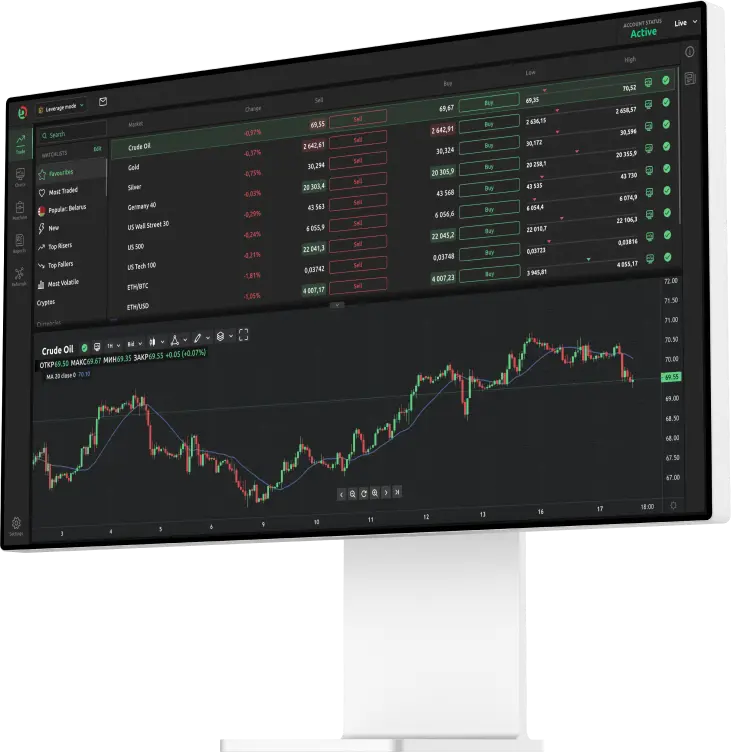
Here's how to read candlestick charts, which are a variant on the bar chart. Our bars here are called “candlesticks” because of their appearance, which resembles a candle with a wick (also known as a tail/shadow) at one or both ends.
The candlestick body indicates the opening and closing prices and is coloured green/blue and red in the same way as before.
However, the range here is shown by the wick, a thin line protruding from the body. The top of the wick indicates the highest price the stock traded at and the bottom of the wick the lowest. If no wick is present, the top or bottom of the candle body is used.
Candlesticks thus give the trader a wealth of information. Generally speaking, the longer the candle body, the more intense the buying pressure. Long green candles can be considered “bullish” and might indicate a turning point in a trend. Conversely, long red candles may show strong selling pressure, which might indicate a trend is coming to an end.
These chart types therefore show us how trading information for a stock or market can be displayed. What we need to know now is how these prices fluctuate over different time periods.
Monthly charts
Monthly trading charts show us the ups and downs of our stock or market each month over longer periods. As they are typically used to analyse time periods of four years of more, they are most appealing to long-term investors, although other traders will also refer to them.
Weekly trading charts
Weekly trading charts illustrate price movement on a weekly basis and are used by traders and investors to analyse stocks and markets over terms in excess of six months.
Daily trading charts
An arguable favourite of many traders and investors is the daily trading chart, which allows analysis of shorter time periods, typically six weeks or more.
Day trading
Intraday trading charts
Drill down even deeper and you can analyse what happens between the opening and closing of a market on a single day.
Intraday hourly charts show the opening, closing and range of prices on an hourly basis, and are used for trades from hours to several days.
Many day or swing-term traders rely on the intraday 15-minute charts to analyse fluctuations on a 15-minute basis, with this type of chart being perfect for monitoring periods of an hour to a few days.
The intraday five-minute chart is the day traders’ favourite, logging the opening, closing and highs and lows of each five-minute period and the intraday one-minute chart continues the theme, creating bars every one minute. The one-minute charts are typically used for “scalping”, or day trades that last from a few minutes to several hours.
Intraday trading charts are invaluable to professional day traders, or traders who are glued to their screen all day. Those of us with only a few hours available would gain little useful information from the handful of bars created by a 15-minute chart, for example.
Chart data analysis
So, once we are monitoring our chart of choice, how do we spot the all-important pattern or trend and decide whether to buy or sell?
Trading patterns
Trading patterns are important as charts tend to produce frequent “signals” that cut through the price action “noise”. Reading these patterns can help you paint a clear picture, flagging trading signals and indicate future price movements.
Patterns are viewed as useful by those who believe that history is likely to repeat itself. These traders believe that by analysing what has happened in the past, they might be able to identify opportunities and avoid problems. But while it can provide context, past performance is no guarantee of future results.
Chart trends
Charts may show certain areas where a grouping of data is plotted in a general direction in a series of peaks and troughs. This is a chart trend. If the highs and lows are ascending this could be considered a “bullish trend”. If they are descending, this is known as a “bearish trend”.
Sideways/flat or horizontal trends are distinguished by more of a straight line, indicating the forces of supply and demand are equal.
In addition, trends may be observed by the time duration as the trend is taking place, as seen in long-term, short-term and intermediate-term trends.
Understanding trading charts
Technical analysts believe that levels that were important in the past will become important again in the future, although they are not always correct in this assumption and can and do get things wrong.
Charts are certainly easier to absorb and understand than other financial information sources such as earnings reports.
A trader’s view of a market can also be influenced by different timeframes, which necessitates their need to pick and choose the charts they use carefully.
But, while valuable, charts are just a part of a trader’s arsenal. It's also important to consider market news, events, research and analysis to to make informed decisions and decide whether to trade. In all cases, you should never invest more than you can afford to lose.
FAQs
Charts are certainly easier to absorb and understand than other financial information sources such as earnings reports. But, while valuable, charts are just a part of a trader’s arsenal. Most traders also consider market news, events, research and analysis to help them spot trading opportunities and make informed decisions.
Intraday hourly charts show the opening, closing and range of prices on an hourly basis, and are used for trades from hours to several days. Many day or swing-term traders rely on the intraday 15-minute charts to analyse fluctuations on a 15-minute basis, with this type of chart being perfect for monitoring periods of an hour to a few days.
Generally speaking, the longer the candle body, the more intense the buying pressure. Long green candles can be considered “bullish” and might indicate a turning point in a trend. Conversely, long red candles may show strong selling pressure, which might indicate a trend is coming to an end.

